Cyberpunk, art deco, photorealism - words you've heard a hundred times already, until they stopped meaning anything. The real power of an image in 2026 doesn't come from recognizability, it comes from collision: when the eye sees something familiar and something it can't name, at the same time. Below are five such collisions - tested, documented, ready to copy.
In one sentence: a non-obvious Midjourney style pairs two elements that don't normally belong together - which is exactly why it holds attention longer than a single, "pretty" motif.
1. Digital Maxxing - hyper-maximalist digital excess
Most creators run toward silence: white margins, one object, plenty of breathing room. Digital maxxing does the exact opposite - it fills every inch of the frame, as if emptiness were something to be ashamed of. Chrome drips with color, surfaces shimmer like gasoline on water, and ornamentation piles up without end. It's an aesthetic drawn from frutiger aero and baroque excess, pushed right up to the edge of what the model can still hold together - and that very edge is where the appeal lives.
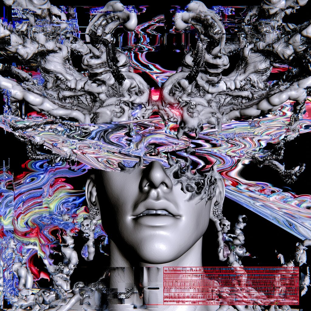
Chrome, glitch, and density instead of empty space - the first digital maxxing example.
The key to this style isn't a single motif, it's density. Midjourney handles dozens of overlapping layers without losing compositional coherence remarkably well, so lean into that instead of fighting it - the more detail, the longer the image keeps giving something back on a second look.
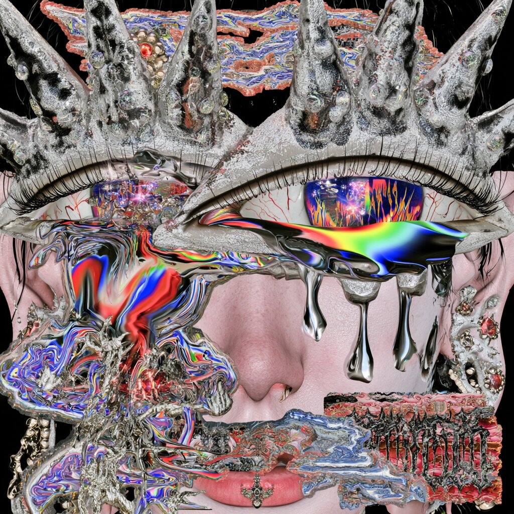
Same style in close-up - the tighter the frame, the more layers there are to find.
Ready-to-use prompt: hyperdetailed chrome and iridescent textures, dense layered ornamentation, maximalist digital collage, glossy 3D render, intricate patterns covering every surface, frutiger aero meets baroque excess --ar 4:5 --stylize 750 --chaos 15
2. Organic Chrome
The same craft as digital maxxing - chrome, iridescence, density - applied to a completely different kind of subject. Instead of a portrait: a still life with a visceral, raw character. Instead of a face: a cut of meat. Instead of jewelry: a metal chain. And where the eye goes looking for a pupil or a wound, a liquid, chrome portal opens up, full of swirling color - as if flesh and machine were trying to occupy the same space at once.
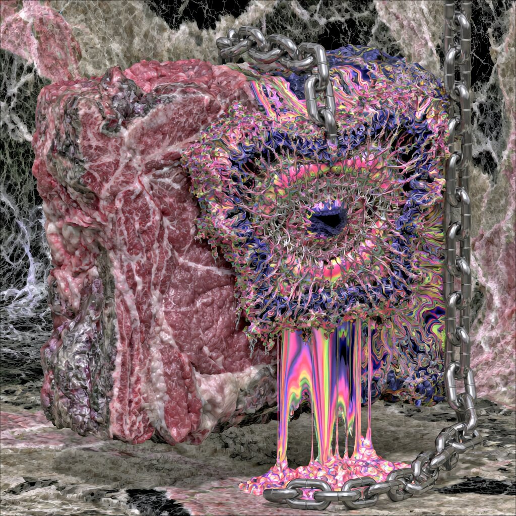
Same chrome, completely different subject - from portrait to still life.
It's proof that digital maxxing isn't one image, it's a scalable craft - you change the subject, the technique stays, and the tension between the organic and the synthetic does the rest of the work on its own.
Ready-to-use prompt: raw cut of marbled meat with a heavy metal chain draped across it, an iridescent chrome portal embedded in the flesh, liquid rainbow color pooling and dripping from the wound, hyperdetailed textures, glossy 3D render, maximalist digital collage --ar 1:1 --stylize 700 --chaos 20
3. New Neon - acid duotone in a woodblock-print style
Neon in Midjourney almost always means the same thing: a wet street, kanji signage, rain reflecting light. That's not non-obvious anymore - it's the default, burned in by thousands of identical generations. This take on neon drops the city lights in favor of something closer to an old screen print or a Japanese woodblock: a flat, high-contrast two-color print, acid yellow-green collided with electric blue, a grainy, printed texture instead of a smooth gradient.
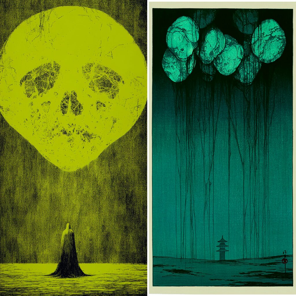
Diptych, two colors, a shared skull motif - this style's signature.
The signature layout is a diptych - two panels in one frame, each in a different color, tied together by a shared motif: a skull, a solitary silhouette, emptiness. The difference from classic neon is subtle but decisive: the color here doesn't signal technology or the city, it signals mood and dread - like an old concert poster or a 19th-century woodblock print filtered through a modern screen.
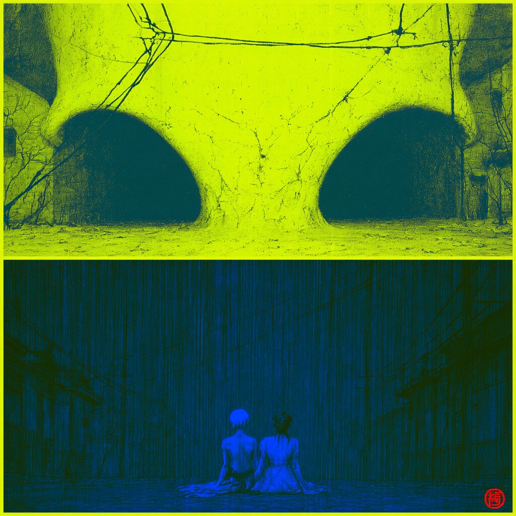
Same color pairing, different composition - a consistent mood regardless of subject.
Ready-to-use prompt: two-panel diptych poster, top panel acid yellow-green duotone, bottom panel electric teal blue duotone, ukiyo-e woodblock print texture, grainy halftone screen print, skull motif, solitary silhouette figure, high contrast graphic illustration --ar 4:5 --stylize 400
4. Pink Death - in the spirit of Kawase Hasui and Beksiński
The name says it all: pink death. It's a collision of two traditions that should never meet - the contemplative aesthetic of Japanese woodblock printing, as in Kawase Hasui's moody shin-hanga landscapes, and the dark, grotesque surrealism of Zdzisław Beksiński. The skull in this style isn't frightening - it's part of the landscape, not an interruption of it, surrounded by cherry blossoms and a stillness we usually associate with scenery, not with memento mori.
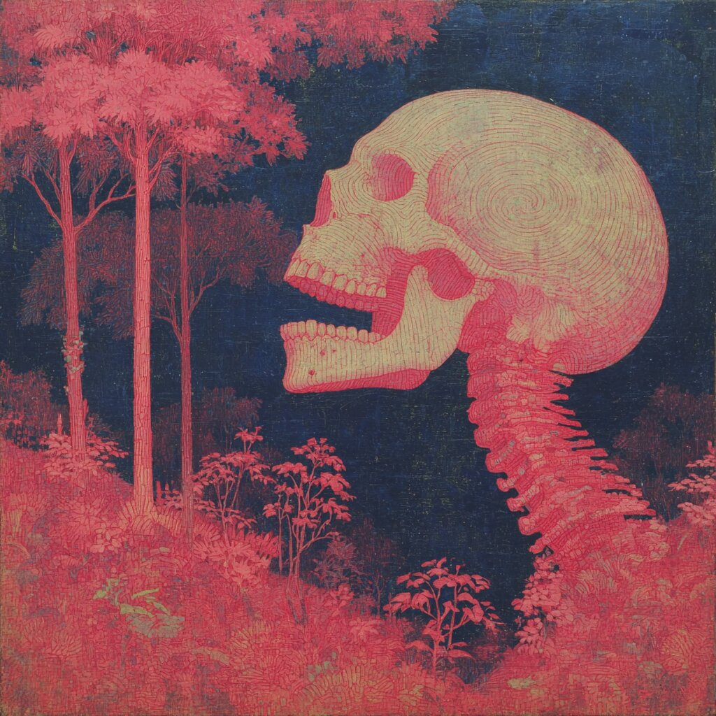
The skull as part of the landscape, not its interruption - precise, engraved linework.
The key is the palette: deep pink and blue instead of the black and grey usually attached to mortality motifs. That reversal of expectation does more work than dread alone - the skull becomes almost beautiful before you register what it actually is.
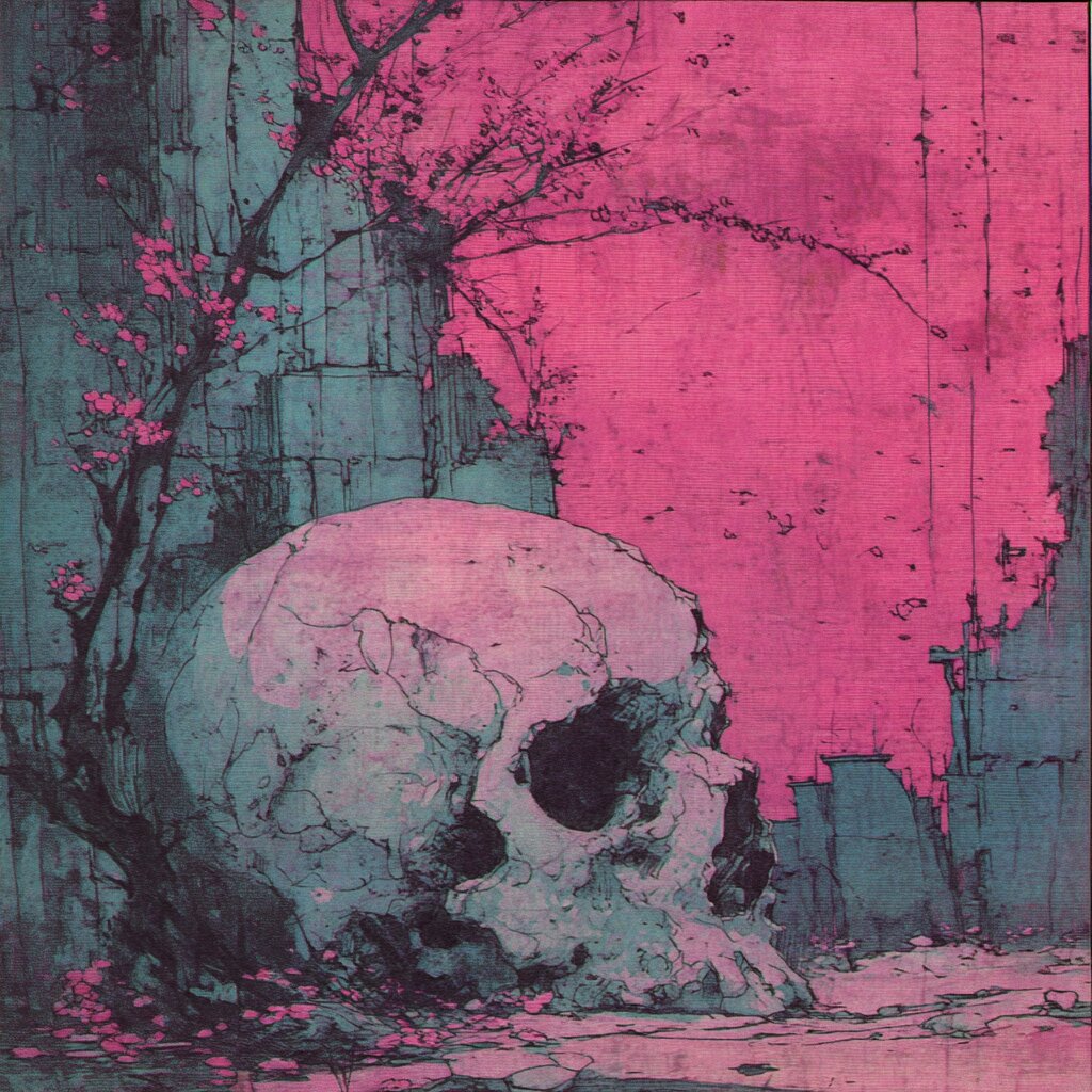
Same palette, different composition - cherry blossoms in full bloom right beside the skull.
Ready-to-use prompt: detailed engraved illustration of a skull in a forest clearing, cherry blossom branches, muted pink and cream color palette with deep navy background, fine linework texture like vintage anatomical prints, mixed style of Kawase Hasui ukiyo-e woodblock prints and Zdzisław Beksiński surrealism, memento mori --ar 1:1 --stylize 300
5. Analog Paradox
The fifth style isn't about color or texture, it's about a collision of moods. The starting point is nostalgic, filmic photography - faded colors, grain, as if pulled from a camera loaded with decades-old film. Into that same frame comes something that has no business being there: a massive, abstract eruption of color, suspended over the scene like an explosion frozen mid-air, a millisecond before it would fall.
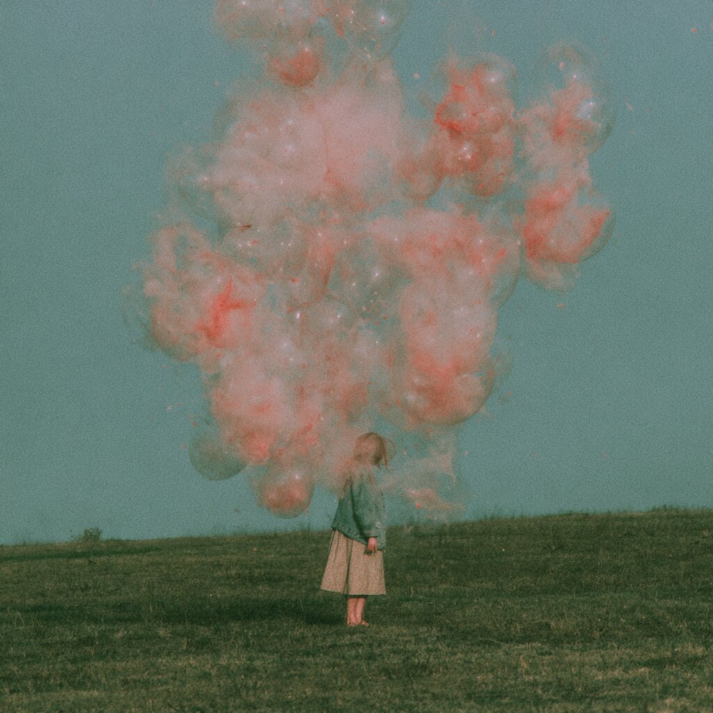
The innocence of a childhood snapshot colliding with something that can't be rationally explained.
This style works best when the scale is deliberately disproportionate - a small, calm figure in the foreground, a giant, chaotic form looming above it. It's the contrast in size and mood, not color, that does all the work: the greater the distance between what's familiar and what's overwhelming, the stronger the image.
Ready-to-use prompt: vintage 35mm analog photograph, faded nostalgic color grading, muted teal and olive tones, a young girl in vintage clothing standing in a field with her back to camera, looking up at a massive surreal cluster of translucent pink smoke bubbles frozen in the sky, dreamlike scale contrast between innocence and an overwhelming abstract force, film grain --ar 1:1 --stylize 300
How to use these styles in practice
- Don't copy the prompt 1:1 for everything. Swap the subject for your own - keep the rest of the style description and the effect holds.
- Test --stylize in both directions. Lower values stay closer to the literal description, higher values give the model more artistic freedom.
- Tune --chaos to the style. Organic chrome and digital maxxing tolerate far more unpredictability than analog paradox or pink death, which work best at low values.
- Combine technique, not just subject. Digital maxxing and organic chrome are one technique on two subjects - try the same move with new neon or pink death.
- Save what works. If a prompt gives you an image you love, save the exact wording - small changes in word order can shift the result significantly.
Key concepts
Frequently asked questions
What is a non-obvious style in Midjourney?
It's a style built on the collision of two elements that don't normally coexist - excess with chrome, for instance, or nostalgia with something enormous and unexplainable. The tension between them holds attention longer than a single, coherent mood.
Will these prompts work on every Midjourney version?
They perform best on the newest models (V7 and later), which understand complex style descriptions better. On older versions, simplify the description to 2-3 key phrases.
Which of these styles is easiest to start with?
Analog paradox or pink death - the lowest stylize values, and a predictable result even on your first try.
Can I combine more than one style at once?
Technically yes, but beyond two overlapping aesthetics the model starts losing coherence. Stick to one, at most two directions in one prompt.
What if the result is too chaotic?
Halve your --chaos and --stylize values and leave the description unchanged - that's the fastest way to calm down a composition.
Summary
Non-obvious styles aren't magic - they come from bold pairings: excess with chrome, flesh with machine, acid color with dread and woodblock print, pink with death, nostalgia with something enormous and unexplainable. Copy any of the five prompts above, swap in your own subject, and see where it takes you.